Exploring LGBTQ+ interior design beyond the rainbow
It’s Pride! it’s Summer! Spruce up your abode but look beyond the obvious rainbow, says Devin Shaffer, Lead Interior Designer at Decorilla Online Interior Design.
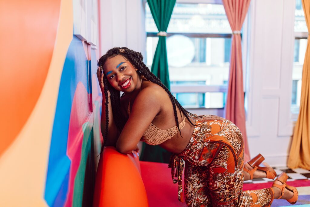
Color in interior design goes far beyond aesthetics: Colors serve as a powerful tool to showcase people’s unique identities and personalities within their space. They count for 90% of our initial impressions and allow us to convey our individuality, passions, and values in a visual and tangible way.
I’m lucky enough to live in the Castro district of San Francisco and, in less than 100 steps, I can get a view of the iconic rainbow flag at Harvey Milk Plaza in all of its 20ft x 30ft glory. Every time I see it, no matter the time of day, I feel overcome with emotion, knowing that so many victories have been made in the LGBTQ+ community.
The flag is a symbol that reminds me, and many others, that we stand on the backs of those who have fought and continue to fight for rights too often taken for granted. While I’ve yet to meet many people who want a rainbow color palette in their homes, drawing on color can be an excellent way to embrace your unique identity.
As a designer, I’m here to help people go beyond the rainbow. Let’s explore how.
Understand the psychological impact
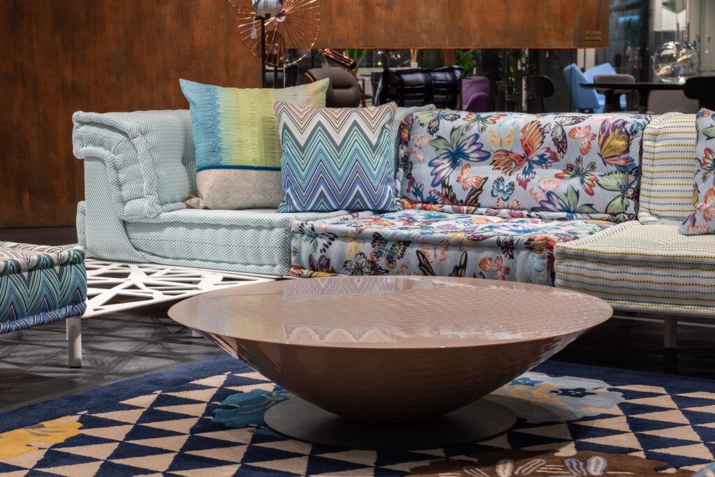
By carefully selecting colors that resonate with you on an emotional level, you can create an environment that not only expresses your personality but also nourishes and uplifts your spirit—and what’s more important than that?
Understanding the psychological impact of color allows and challenges designers to harness its power. As a professional interior designer, it’s vital that clients’ homes are visually appealing and nurturing spaces that positively influence their mental and emotional well-being.
I also love that people get to feel something unique to them when seeing certain colors and are often inspired to assign names to the colors they see. What is salmon to one person is lipstick to another, and that reminds me of how marvelous humanity is!
The beauty of color is that it is communicative and wants to be embraced and explored, cried and yelled at, changed and preserved, played with and left alone… Colors have the power to evoke emotions, set moods, and create unforgettable impressions. As a result, people approach specific colors at different times because of that.
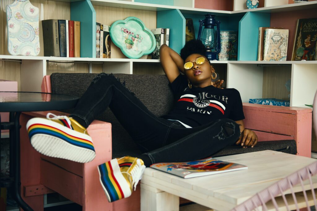
Don’t be afraid to express yourself
Surprisingly, maybe 90% of my clients are initially afraid of color! To combat this, I tap into my clients’ preferences to carefully select colors that deeply resonate with them on a personal level. New AI technologies are also helping people explore color palettes more deeply than just painting a section of a wall, as well as excite their creativity with moodboards and ideas of bespoke furniture.
At Decorilla, we’ve embraced technology from the get-go and we’re excited now more than ever before to integrate all the new technologies popping up, especially AI. With our AI-powered virtual reality (VR) and augmented reality (AR) tools client’s can now visualize and experience their future spaces before any physical changes are made—reducing the risk of disappointment.
Whether it’s a burst of sunny yellow in the kitchen, a serene blue in the bedroom, or a playful pop of pink in the living room, color is a way to breathe life into a space. I often find the more colors I start to add to a design, the more clients want to explore new colors and even even explorative mixing and matching that I wouldn’t have thought of on my own.
Unfortunately, like anything else, color can be dangerous and destructive. Because of that, I work with colors in a way that promotes well-being, joy, and happiness, which sometimes makes me feel like a psychologist. It’s always important to remember the colors used in interior design are what people end up living with—and that will ultimately affect their mood and subsequent quality of life.
Know a little goes a long way
Each color of the LGBTQ+ rainbow has a special meaning and, because of that, a connection with a color from the flag goes far beyond aesthetics and has inherent associations. The flag’s original colors included pink for sexuality, red for healing, yellow for sun, green for nature, turquoise for art, indigo for harmony, and violet for spirit.
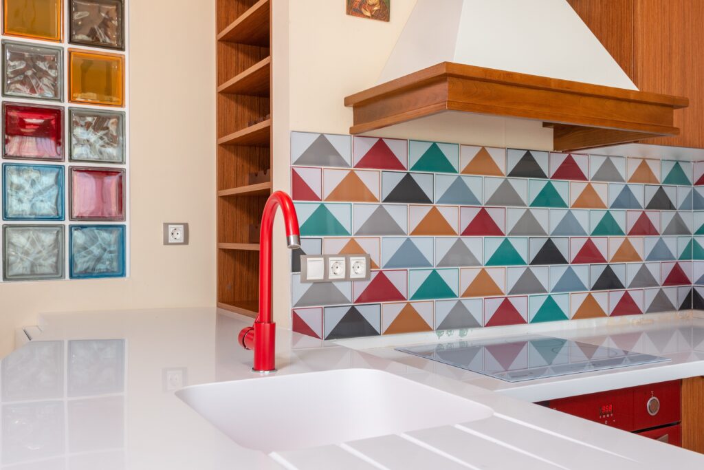
One of my favorite tactics for adding the colors of the rainbow into a design project is to focus on an 80% neutral palette (think white and gray) with 20% color (think a mix of up to five coordinating colors). That way, you can visualize a rainbow when looking at the decor pieces without overwhelming the room.
Color has historically been used to communicate messages of empowerment, acceptance, or resilience. For example, incorporating purple—a color associated with LGBTQ+ history and the fight for equality—can create a sense of historical grounding and pride. While you might not want to include every color of the rainbow in your space, you can still harness the power of the flag by choosing a few that resonate with you.
From the vibrant rainbow flag to personal passions, a good designer will help you harness color and interior design to help you convey who you are and feel comfortable in your surroundings. Color is more than just aesthetics; it’s a powerful tool for anyone—LGBTQ+ or otherwise—to express themselves in an authentic way.

About the Author
Devin Shaffer is the Lead Interior Designer at Decorilla, the company at the forefront of interior design known for bringing VR technology to the industry and redesigning thousands of households in 2020. His focus is on holistic approaches to projects with comprehensive phasing. He has been mentioned on The Wall Street Journal, New York Magazine, Realtor.com, She Knows Magazine, Curbed.com, Property Club NYC, How Stuff Works, Chicago Daily Herald, SF Gate, MSN news and Heavy.com
