Pantone’s Peach Fuzz is for the vintage lovers and the queer community
Devin Shaffer, Lead Interior Designer at Decorilla gives us a preview of the Pantone color of the year.
Every year, the color company Pantone releases a color they believe will make its rounds for the next 12 months. Immediately, these colors cause a stir of praise and discomfort as some people project new life in these shades, while others conflate the trendy with the easily forgettable. That color is Peach Fuzz this year, and it hasn’t been less than polarising.
At first sight, Peach Fuzz feels soft and gentle. Pantone even deems it as a “healing” color — like the way hospital gowns come in very soothing shades to calm patients down. And it’s easy to understand why the color company chose it for 2024. As the news cycle continues to get more tumultuous, bills don’t stop, and everyone is in constant survival, Peach Fuzz invites people to stop and meditate on its slightly unusual yet inviting tone.
At the same time, it feels very much like a throwback to the 20th century. This pastel orange was present in cool 1940s kitchens, was all the rage in 1970s beachwear, and even seeped into the color palette of tiles and furniture in the 1980s. So, it feels like an ode to the good old days, a neutral color that helps more vibrant ones stand out: Peach Fuzz isn’t overpowering but uplifting.
A nod to the queer community
This year’s creamy, orangey tone lets other colors have their moment, making it a great neutral of tan, beige, and fawn. As a result, it doesn’t feel feminine or masculine — it’s its own mysterious element that shapeshifts depending on where you put it. And this lack of a binary simply strikes a chord with the queer community, which embraces fluidity and often escapes labels.
Surprisingly, Vogue India called Peach Fuzz a polarising choice and a sensual tone. Perhaps the shade alone is as polarising as it was for men to wear pink back in the day. Now, straight and gay men proudly wear all kinds of pink shades to look stylish. So, Peach Fuzz is another case of colors breaking paradigms and challenging stereotypes to arrive at a deeply chic, sensual vibe. That acceptance of what is, without judgment, is what defines the queer community.
Although it isn’t part of the bright colors queer spaces are often draped in, Peach Fuzz is a quieter statement to portray the duality, or even blurred lines, of many in the queer community.
Unapologetically vintage
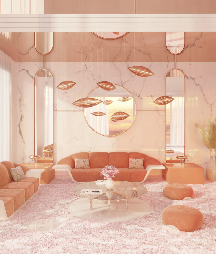
Peach Fuzz is nothing but an instant classic. That’s because it’s been prevalent in many defining styles and periods but has managed to go under the radar. Think of the 1970s Flower Power, a man in a light orange shirt with a massive collar and a woman wearing a peachy mini-skirt.
Likewise, Peach Fuzz could’ve easily been included in a sparkly 1920s flapper dress being worn at a glamorous speakeasy. Already, these examples show that there are various color schemes that go well with this shade.
For example, a retro palette starts with a navy teal, goes through a buffalo brown, and easily ends on a Peach Fuzz tone. For a more antique style, hues could start at an olive green, continue to a dark rose, and then transition into more neutral hues of beige and Peach Fuzz. While it never stole the show, it was always a part of it. Now, it’s taking center stage.
So, this Pantone Color of the Year has the power of versatility to blend or take a more dominant role — it all depends on how it’s applied. How you incorporate it into interior design is another feat worth exploring in 2024.

The trick to incorporating Peach Fuzz
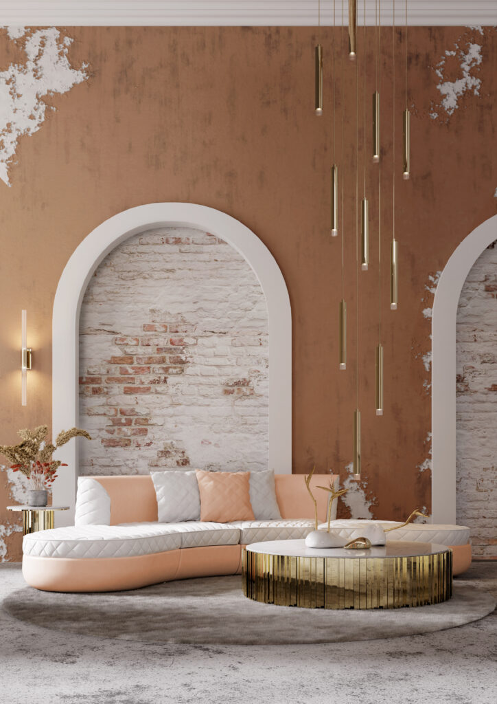
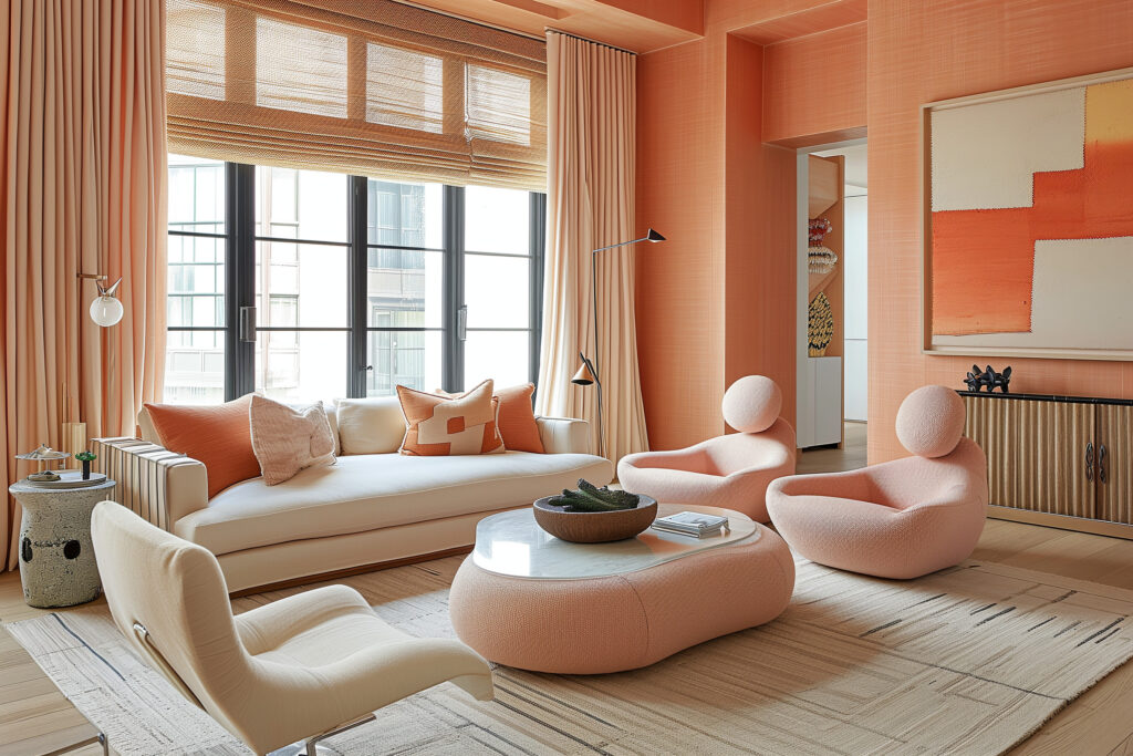
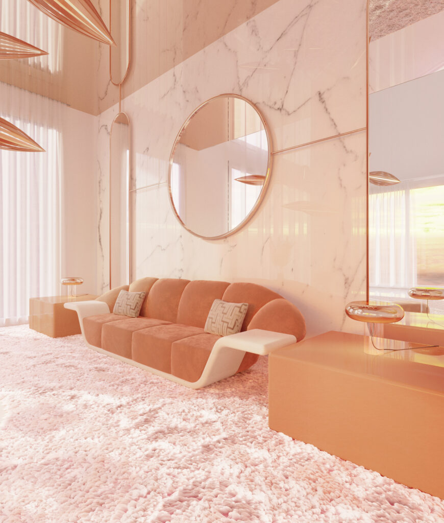
From an interior design perspective, Peach Fuzz is almost a dream color to work with. At first glance, you know you don’t want to shove it on people’s faces with a big piece of furniture or an entire wall. Instead, it’s a pop of color that makes a massive difference in a monochromatic space. To implement it, people should make it 15-20% of their decor, no more than that.
Plus, wallpaper is expensive, and so is a paint job, so investing too much into a color that is meant to complement others is simply not worth it. However, Peach Fuzz is the perfect addition to dinnerware items like ceramics: Think teacups or dessert plates (articles that aren’t the main characters but play important roles in special gatherings and moments at home). On a rustic table with a natural color, Peach Fuzz might even work as a table runner against earth-tone dinnerware for an eye-catching contrast.

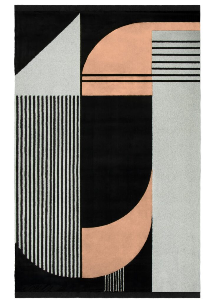
In bedrooms and living rooms, the orange pastel hue plays perfectly as lines in patterned throw pillows or blankets — on its own, it might be too mute. Like the Robin to Batman, Peach Fuzz is the perfect backdrop for textures and fabrics. It can be one of the colors in a midcentury-style rug, on nightstand decor, or even somewhere in a curtain pattern.
Pantone’s choice for the 2024 Color of the Year feels inclusive, playful, and stress-free in such frazzling times. While it might be viewed as a fleeting hue, Peach Fuzz has been around and will remain on many design choices and apparel worldwide for its ability to expertly complement other colors. For the queer community, it’s an opportunity to embrace this adaptable shade and make it their own, as it is complex and hard to pin down but lovely to look at.

About the author
Devin Shaffer is a leading voice for the latest interior design trends and news, with notable mentions in The Wall Street Journal, HGTV, NBC News, Architectural Digest, New York Magazine, Realtor.com, Property Club NYC, Insider, SF Gate, Yahoo news and The Today Show.


