The Zen Practice of Designing a Logo
Graphic Designer and Art Director for Queery, Geoff Peckman, reveals the thinking behind the Queer Zen Meditation logo.
Queery’s mission is to educate and use the arts to bring our LGBTQ and allied communities to a place of unity and better understanding. In conjunction with this, we wanted to find a way to keep people connected and relaxed during a time when folx often feel stressed and alone.
Meditation is one way we can accomplish this goal, and so Queer Zen was born and became the meditation component of Queery. It is a weekly program cosponsored by The LOFT LGBT Community Center that offers a safe space for queer communities to connect with themselves and others through music, language and the stress-reducing art of meditation. But every great program needs an equally great logo, doesn’t it?
So, how did we create the logo for Queer Zen? Let’s start by saying that designing a cool logo isn’t an easy task. The artwork, or logotype, must in some way give the viewer an understanding of what Queer Zen is about, be visually appealing, and still be a design that folx will find recognizable and relatable. Plus, it needs to be queer centered to represent our community.
We started by thinking about words that related to meditation, such as centering, relaxation, spirituality, mind and body, and of course, being Zen. This led us to using a Zen circle. What is a Zen circle, you ask? And why not a Zen square or Zen triangle? Well, we at Queery love questions and will get to that first one in a moment. Let’s respond to the second one by taking a quick historical look at the circle and what it represents.

Predating recorded history, the circle has long been a fascination for all personkind. Did you know that many ancient cultures discovered approximations for the ratio of a circle’s circumference to its diameter, otherwise known as pi, thousands of years ago? This was before mathematicians even knew what to call this formula.
In Ancient Greece, this symmetrical shape came to represent the “divine” and “natural balance,” (Ezri, Li Zhou, March 12, 2015) and was therefore used profusely in Greek architecture. In Chinese culture, the circle stands for such things as “oneness”, “perfection”, and “unity” (Kane GAO, April, 23, 2012). Let’s look at Japanese culture’s take on this shape which will bring us back full circle — pun intended — to Buddhist thinking and the Zen circle.
So, what is a Zen Circle? The Ensō circle, or as we call it the Zen Circle, is a sacred symbol in the Zen school of Buddhism. Although it is not a Japanese character, this symbol is one of the most commonly used in Japanese calligraphy. The single brushstroke ensō is supposed to be created in a single breath.
Interesting fact: The two kanji symbols that make up the word ensō translate to Mutual Circle or Circle of Togetherness (modernzen.org, July 13, 2020). Indeed, the Zen circle represents so many things. It is a symbol of the beginning and the end, the circle of life, and the connectedness of existence. It references fullness and emptiness, infinity and nothingness (think yin and yang), the perfect meditative state, and Satori or enlightenment.
It has been said that the circle represents the acceptance of imperfection as perfect, the spirit of harmony, and a sense of completeness. You can see how many of these words relate to the art of meditation and a connectedness we can all share.
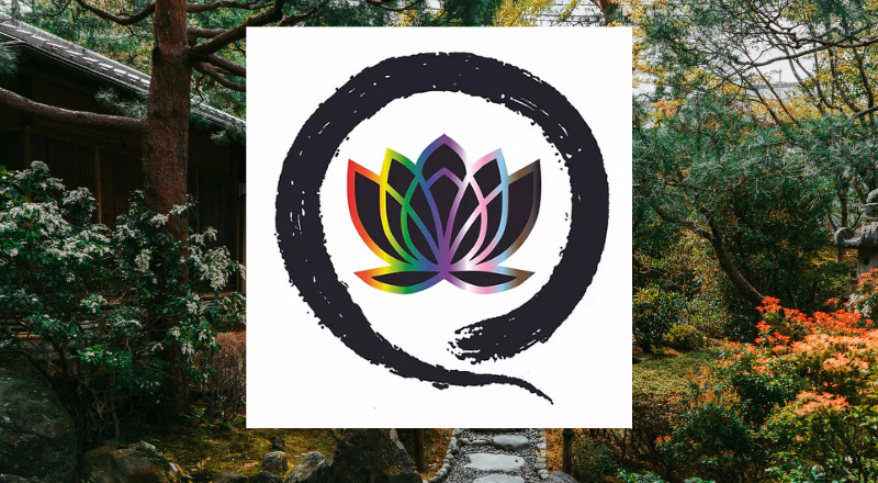
Does this explain why we chose to use a Zen Circle in our logo? We think so. And if you look closely at our Zen circle, you will notice that it comes around and ends in a tail that makes it look like a Q. Q as in Queer Zen!
Inside the Zen Circle is a lotus flower. Much like a circle, the lotus has its own ancient history. For instance, the Egyptians used the lotus profusely in many of their hieroglyphics. As a flower that was thought to retract at night and arise in the day, the Egyptians associated the lotus with the sun, rebirth and creation (Kyle Gordon, January 2, 2020).
The lotus flower has many meanings in Hinduism as well. In this religion, it is associated with beauty, fertility, prosperity and spirituality. It is interesting to note that the lotus is different from its sister flower, the water lily, in that lotus leaves and flowers are emergent — meaning they open and rise above the water level (Jaymi Heimbuch, May 10, 2019). This is likely the reason why Buddhists consider the petals of the lotus to depict the opening of the heart.
In Buddhism, the lotus also relates to purity and spiritual awakening. The flower is considered pure due to its pristine emergence from the muddy waters where it grows. And like the Egyptians, the lotus also symbolizes rebirth in Buddhist culture. So why not use this beautiful flower which brings to mind the yoga pose of the same name (also used in meditation), as well as spirituality, awakening, purification and rising out of the darkness?
Like a hug, we combined our 2 elements, the Zen Circle and the lotus flower, by wrapping one around the other. To give the logo a touch of “queercentricity,” we added the colors of the Progress Pride flag. This includes the red, orange, yellow, green, blue and purple of the standard rainbow Pride flag, plus the transgender flag colors (light blue, pale pink and white), and also brown and black to represent people of color.
If you’re not familiar with this particular flag, check out our Pride Zoom Backgrounds at www.queery.us for a look. We felt creating a halo effect around the flower using this flag’s colors would emphasize the beauty of the lotus. And so, the Queer Zen logo was brought into existence. Now you know the complete symbolism behind creating our QZ logo.
Why not get it on a t-shirt? Visit our shop by going here: www.queery.us/online-store.


